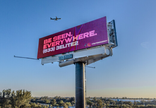
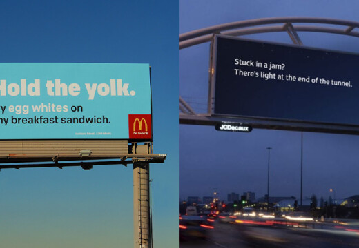
Billboard ads succeed when they grab attention fast. Here’s how to pick the perfect image for your billboard:
- Keep it Simple: Use clean, uncluttered visuals with one main focus.
- Bold and Clear Graphics: High-contrast colors and high-resolution images work best.
- Match Viewing Conditions: Design for distance, speed, and lighting.
- Align with Your Message: Ensure the image reflects your brand and supports the ad’s purpose.
- High-Quality Files: Use images with at least 300 PPI and proper dimensions.
- Test for Effectiveness: Check visibility from different angles and distances.
- Update Regularly: Refresh designs to stay relevant and avoid ad fatigue.
A good image can make your billboard pop, even in just a few seconds of viewing time. Focus on clarity, brand alignment, and regular updates to maximize impact.
4 Billboard Design Tips
1. Use Simple, Clean Images
In billboard advertising, keeping things simple is key. Drivers only have about 5–10 seconds to take in your message , so a clean, straightforward design makes it easier for them to understand quickly.
Remove Visual Clutter
The best billboard designs stick to the basics. Include just three main elements: a bold image or graphic, a clear call to action, and your logo . This minimalist approach ensures your message is easy to grasp.
"The 3-second rule is simple: the viewer should be able to gather all the information on the billboard in under 3 seconds." – Stimulus Advertising
To make your billboard stand out:
- Leave out unnecessary details like “www.” in web addresses.
- Add space around key elements to avoid a crowded look.
- Use clear borders to keep text from running off the edges .
- Stick to one main visual focus .
Choose Bold, Clear Graphics
Your visuals need to be eye-catching and recognizable, even from a distance. High-resolution images (at least 300 ppi) will keep your billboard looking sharp and professional . Strong graphics that align with your message create what experts call an “instant get” .
For better visibility:
- Use high-contrast colors that pop.
- Pick visuals that look good up close and far away.
- Ensure graphics work with, not against, your text.
- Go for bright colors that stand out from the surroundings .
The brain processes images faster than text, so a clear, bold design can make your message stick .
Here’s how key factors influence your design choices:
| Viewing Factor | Design Tip | Result |
|---|---|---|
| Distance | Use big, bold visuals | Easy to see from far away |
| Speed | Keep it simple | Quick to understand |
| Contrast | Pick bright colors | Stands out from the environment |
| Resolution | Use high-quality images (300 ppi) | Professional and sharp look |
Digital billboards, like those on platforms such as Blip, allow you to test different designs and tweak them based on performance. This flexibility helps ensure your message stays impactful and clutter-free.
2. Match Images to Viewing Conditions
When creating billboard designs, it’s important to ensure your images are optimized for the way they’ll be seen in the real world.
Make Images Visible from Far Away
A billboard’s effectiveness starts with making sure its images are easy to recognize from a distance. For a standard viewing range of 400–500 feet, clarity is key .
Here are some useful size guidelines:
| Image Element | Minimum Size | Maximum Viewing Distance |
|---|---|---|
| Main Text | 12″ height | 525′ |
| Logo | 24″ height | 1,000′ |
| Key Visual | 36″ height | 1,500′ |
To ensure your design works:
- Test mockups by viewing them from 500 feet away.
- Use high-resolution images (at least 300 ppi) .
- Add a thin dark stroke around text to make it stand out against the background .
Design for Moving Traffic
For billboards targeting drivers, you have a very short window – just 4–5 seconds – to grab attention . This makes smart image choices essential.
For high-traffic areas, focus on:
- Contrast and Clarity: Use bold, rich colors for daytime and lighter tones like pastels for nighttime. Avoid clutter that slows down understanding .
- Simplicity: Stick to one dominant visual that communicates the message instantly.
- Scale: Make key elements large enough to be noticed quickly.
Digital billboards offer flexibility with daypart scheduling, so you can adjust designs based on traffic flow and lighting. For slower traffic during rush hour, you can include more detail. On highways with faster-moving vehicles, prioritize bold and straightforward visuals.
Other factors like weather and physical surroundings also affect visibility. Test your billboard by:
- Checking how it looks from different angles.
- Ensuring it’s readable in varying weather and lighting conditions.
- Confirming there are no obstructions like trees or buildings .
Urban areas with pedestrian traffic allow for more detailed designs, while highways call for simple, high-impact visuals. Always aim for instant recognition over intricate details.
3. Pick High-Contrast Colors
Use Colors That Pop
When it comes to billboards, color contrast is key. High-contrast designs can improve message recall by up to 38% . For the best results, try pairing these color combinations:
| Background Color | Text Color |
|---|---|
| Yellow | Black |
| Red | White |
LED displays can reach up to 8,300 cd/m² , so it’s important to choose colors that perform well in both bright daylight and nighttime settings.
Here are a few tips to improve visibility:
- Skip white backgrounds – they can cause glare .
- Opt for rich, bold colors instead of pale pastels .
- Test your design in grayscale to ensure good tonal contrast.
Using these techniques helps make your billboard visually striking while staying true to your brand.
Align Colors With Your Brand
Take the South Dakota State University Jackrabbits‘ logo as an example. Their use of blue and yellow strikes a balance between contrast and brand identity .
When working on digital billboards, keep these factors in mind:
- Nighttime billboards typically operate at 1,980 cd/m² .
- Lighting changes can alter how colors look.
- Certain color combinations might cause edges to blur, reducing readability .
To fine-tune your design:
- Use a color wheel to find complementary colors that align with your brand .
- Convert your design to grayscale in Photoshop to confirm strong contrast .
- Test your colors in different lighting conditions to see how they hold up .
sbb-itb-2e2e93f
4. Match Images to Your Message
Stay True to Brand Style
Your billboard images should reflect your brand’s identity. As Jon Holbrook, Product Marketing Manager at Mailchimp, explains:
"Having a unified brand message goes a long way toward helping you connect with your target audience. When you communicate your brand message consistently, your marketing is more persuasive and credible, which drives business results."
To maintain consistency, focus on these key visual components:
| Brand Element | Specification Requirements |
|---|---|
| Logo | Clear placement and usage guidelines |
| Colors | Exact hex codes for digital displays |
| Typography | Defined headline and body fonts |
| Photography | Established style parameters |
| Icons | Industry-specific branded elements |
Refer to your brand style guide to ensure visuals align with your identity. This consistency not only fosters trust but also makes your brand more memorable . A strong foundation in brand alignment will help you choose imagery that complements your message effectively.
Support Your Main Message
Brand consistency is important, but the image you select must also reinforce your core message. Choose a single, high-quality image that supports your main point without overshadowing your text .
Studies show that images featuring human faces can boost engagement on platforms like Twitter by 38% to 291% . High-quality, professional visuals also tend to perform better in capturing audience attention .
5. Use High-Quality Image Files
Avoid Image Quality Problems
High-resolution images make a big impact on digital billboards. They improve message retention, boost brand trust, and grab more attention. For example, digital billboards with better resolution are remembered up to 45% more. A pixel pitch of 6–10 mm is ideal for clear, sharp displays .
Here are a few key technical factors to keep in mind:
| Quality Element | Requirement | Why It Matters |
|---|---|---|
| Resolution | At least 300 PPI | Ensures sharp and clear visuals |
| Color Profile | RGB | Best for digital screens |
| File Size | Under 2MB | Speeds up processing |
| File Format | .jpeg or .png | Balances quality and file size |
Stick to these standards to ensure your images look flawless on digital billboards.
Follow Technical Guidelines
Once you’ve selected a high-quality image, make sure it fits the technical specs for digital billboards:
| Billboard Size | Recommended Dimensions |
|---|---|
| 25′ x 40′ | 460 x 780 pixels |
| 24′ x 36′ | 460 x 680 pixels |
| 14′ x 48′ | 260 x 880 pixels |
| 12′ x 40′ | 260 x 880 pixels |
Steps for preparing your files:
- Start with the best quality source image.
- Match the billboard dimensions, use RGB color mode, keep the file size under 2MB, and export as .jpeg or .png.
While higher-resolution screens may come with a higher price tag, they provide better visibility and engagement.
If you’re using Blip‘s self-serve digital billboard platform, begin with Generic sizes for your designs. If you notice any issues with how your ad appears on specific billboards, create Exact size versions tailored to those locations for the best results.
6. Check Image Effectiveness
To ensure your billboard communicates its message effectively within the brief 5–10 second viewing window, it’s crucial to test your images for clarity and impact.
Test Image Visibility
Your billboard image needs to be clear and easy to read from different distances. Frank Rolfe from the Billboard Mastery podcast highlights:
"The general theory on this is that for sign to have good visibility, you have to have 400 feet of clear visibility right as you come up on the sign. As long as you can see the sign for about 400 to 500 feet away, that’s the point which you can actually read the ad."
To ensure visibility, consider these steps:
- Check the Environment: Visit the location and evaluate how the billboard looks under various conditions, such as:
- Morning, afternoon, and evening lighting
- Different weather scenarios
- Viewing from multiple angles
- Look for Obstructions: Identify anything that might block the view, like trees, buildings, or other signs.
Once you’ve confirmed the billboard’s physical visibility, move on to digital tools for more precise adjustments.
Use Design Review Tools
Design review platforms can simplify the testing process and help ensure your billboard meets technical and visual standards. These tools allow you to:
- Preview how your artwork will appear on different billboard sizes
- Keep track of design iterations
- Confirm that your images meet required specifications
- Simulate how your design performs in real-world conditions
For example, Blip’s self-serve digital billboard platform lets you preview your design across various billboard formats before launch, ensuring it looks great no matter the display.
When testing, focus on these key aspects:
- Check designs at the exact pixel dimensions for the target billboard
- Ensure fast image load times and proper resolution
- Test color contrast under different lighting conditions
- Review readability during peak viewing times
Thorough testing ensures your billboard not only looks good but grabs attention when it matters most.
7. Update Images Often
Keeping billboard content fresh is essential for maintaining audience interest. Digital platforms make it easier than ever to update content regularly, ensuring your message stays relevant. This approach works hand-in-hand with the clean and clear visuals we’ve discussed earlier.
Keep Content Fresh
How often you update depends on the type of billboard and your campaign goals. Here’s a quick breakdown:
| Billboard Type | Typical Duration | Best Practice |
|---|---|---|
| Standard Static | 4–8 weeks | Refresh after each campaign cycle |
| Digital | 1–4 weeks | Rotate content every 6–8 seconds |
| Short-term Campaign | 1–2 weeks | Update based on promotion timing |
Frequent updates help avoid "ad blindness", where viewers stop noticing repetitive content. For digital billboards, rotating messages throughout the day can target different audiences, such as commuters in the morning and evening.
Match Images to Current Events
Staying relevant is just as important as regular updates. Tailor your visuals to align with current events, seasons, or local culture. Here are a few ideas:
- Seasonal Updates: Adjust visuals to reflect the season, weather, or upcoming holidays. For example, a winter-themed ad in December shows your brand is engaged with the community.
- Interactive Campaigns: Take inspiration from campaigns like Netflix’s Marvel posters, where people could tweet hashtags to influence which character appeared on the billboard.
- Local References: Incorporate nods to local landmarks or events to make your message feel more personal and relatable.
Before launching new content, preview it to ensure everything aligns with your brand. Tools like Blip offer intuitive interfaces to help manage updates while maintaining consistency.
Conclusion: Put These Tips to Work
Creating effective billboard ads requires smart image choices and careful planning. With only 6–10 seconds for viewers to take in your message , selecting the right visuals is key to crafting campaigns that grab attention and leave a mark.
Digital platforms have made billboard advertising more accessible than ever. Take it from Chris Leslie, Founder of Leslie Lightcraft Co:
"It’s not a social media thing that you see on your phone. It’s not word-of-mouth. It’s big and bold and out there in public. I would say this is the first step of looking big and public."
– Chris Leslie
Paul Willey, Owner of Mr. Charlie’s Chicken Fingers, shares how this approach helped his business:
"Working with Blip has given Mr. Charlie’s the momentum to get our new location on the map while accelerating growth for our original location."
– Paul Willey
Platforms like Blip (https://blipbillboards.com) allow you to experiment with different images and fine-tune your strategy using real-time performance data. This makes it easier to adapt your visuals for better results.
Start small – just $20 a day can be enough to test your ideas. As you see what works, you can scale up your efforts. The combination of smart image selection, strategic placement, and regular updates can boost your campaign’s effectiveness.
Finally, remember that billboards are just one piece of the puzzle. They work best when paired with a broader marketing plan , where eye-catching visuals help create memorable impressions.


