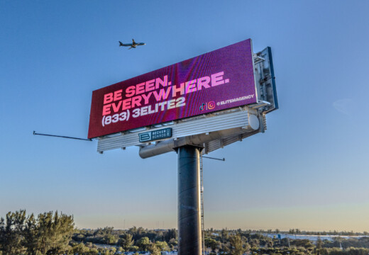
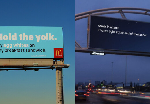
Billboards are a powerful way to grab attention, but common design mistakes can ruin their impact. Here are 5 key pitfalls to avoid when creating a billboard:
- Too Much Content: Keep it simple – use a short headline, your logo, and one striking image. Drivers only have seconds to see your message.
- Weak Color Choices: Use high-contrast colors to make your design pop and stay readable from a distance.
- Hard-to-Read Text: Stick to bold, large fonts and limit yourself to two font styles. Ensure strong contrast between text and background.
- Ignoring Location: Tailor your design to the environment – consider traffic speed, viewing angles, and lighting.
- Disconnected Images and Text: Align visuals with your message to avoid confusion. They should work together to tell one clear story.
Five Big Mistakes in Designing a Billboard
1. Too Much Content
Packing too much into your billboard waters down your message. Drivers have only a few seconds to catch what you’re saying, so keeping things simple is key.
Billboards require a clear, focused approach. Chris Leslie, Founder of Leslie Lightcraft Co., puts it perfectly:
"It’s not a social media thing that you see on your phone. It’s not word-of-mouth. It’s big and bold and out there in public. I would say this is the first step of looking big and public."
The best billboards stick to three main elements:
- A short headline
- Your brand name or logo
- One eye-catching visual
Why? Because cluttered designs make it harder for people to remember your message and act on it. Think of your billboard as a bold visual statement – simple but creative. Ray Bowens, Founder of Hashtag-Vape, highlights the value of this approach:
"Billboards are one of the most impactful ways to advertise, and with Blip, you spend a fraction of what you would end up paying elsewhere."
Want to make your billboard pop? Strip away anything unnecessary and focus on your core message. Try the "squint test" – if your message isn’t clear when you squint at it, it’s time to simplify.
The power of outdoor advertising lies in its boldness. Kimberly Pinkson, Owner of Pretty In Pinkston, explains:
"Blip works for us. It’s a different medium, and it brings a lot of exposure. It sets us apart from the rest of the [competition], and that’s what I like."
Aim to create a single, unforgettable impression. Your billboard isn’t the place for a detailed sales pitch – it’s all about delivering a striking visual that sticks.
Next, we’ll look at how poor color choices can weaken your ad’s effectiveness.
2. Weak Color Combinations
Choosing the right colors is crucial for your billboard’s success. Poor color combinations can not only make your design less appealing but also make your message hard to see for drivers passing by. The key lies in using strong contrast.
High-contrast visuals help ensure your message stands out, even from a distance. Steer clear of colors that are too similar, as they can strain the eyes and blend together. Instead, pick color pairs that pop, regardless of lighting or background conditions.
A clear visual hierarchy is also essential. It helps guide the viewer’s eyes through your message, making it more memorable. Stick to color combinations that are easy to read, stand out in all environments, and grab attention immediately.
sbb-itb-2e2e93f
3. Hard-to-Read Text
Typography plays a key role in creating effective billboards. Even the most attention-grabbing message won’t work if drivers can’t read it within seconds. To make sure your message is clear, use large, bold text that’s easy to read from a distance.
One common mistake? Fonts that are too small or overly intricate. Stick to clean, easy-to-read fonts and limit yourself to two font families to keep the design simple and uncluttered. Make sure there’s a strong contrast between the text and the background – like dark text on a light background – to make the message pop.
For best results, follow billboard design standards, such as those outlined by Blip. This includes scaling your text properly and using a clear hierarchy. Larger, straightforward text helps ensure your message gets noticed quickly.
4. Ignoring Location Factors
A billboard’s location plays a huge role in its effectiveness. What works in one spot might completely miss the mark in another. Factors like traffic speed, viewing distance, and placement all influence how well your design communicates. For instance, on busy highways, designs should be ultra-simple so drivers can grasp the message in just seconds. In city areas with slower traffic, you can afford to include a bit more detail.
The environment shapes how your design is perceived. Longer viewing distances call for larger text and clean layouts, while billboards at sharp angles need bold, oversized text to remain readable. The goal is to ensure clarity and impact, no matter the setting.
Paul Willey, Owner of Mr. Charlie’s Chicken Fingers, shared his thoughts:
"Working with Blip has given Mr. Charlie’s the momentum to get our new location on the map while accelerating growth for our original location."
When planning your billboard, keep these environmental factors in mind:
- Traffic patterns: High-speed roads require designs that can be read in just seconds.
- Surrounding structures: Nearby buildings or trees can block the view.
- Lighting conditions: Both daylight and artificial lighting impact visibility.
- Viewing angles: Tailor layouts to the direction and distance from which the billboard will be approached.
To make your billboard stand out, every design element – text size, layout, and visuals – must align with the specific location and viewing conditions. It’s all about delivering your message effectively in the environment where it will be seen.
5. Disconnected Images and Text
It’s not just about having clear text and a clean layout – your visuals need to work hand-in-hand with your message. If the images and text on your billboard don’t align, the result can be confusion and a diluted message. Think of your billboard as a single story where every element backs up the main idea. The visuals and text should work together, not against each other.
Using images that clash with your message can throw people off. For example, imagine promoting a luxury spa but using visuals of high-energy sports. That mismatch creates confusion. Since people only have a few seconds to take in your billboard, mixed signals can mean lost attention.
Here are some tips to ensure your visuals and text are in sync:
- Visual hierarchy: Make sure the image enhances, not overshadows, the text.
- Message alignment: Use visuals that clearly tie into or expand on your message.
- Emotional tone: Match the mood of your visuals with the feeling your message conveys.
This kind of alignment helps create a billboard that sticks in people’s minds. For example, if your headline says "Fresh Local Produce", your visuals should show bright, appealing photos of actual fruits and vegetables from local sources – not generic stock images or abstract designs that don’t connect to your message.
Tools like Blip allow advertisers to test combinations of images and text, making it easy to adjust based on real-time feedback. Your billboard should pass the "glance test": if someone can’t immediately connect the visuals to the text within 3 seconds, it’s time to rethink the design. Aim for an instant, clear connection between what people see and what they read.
Conclusion
Creating a great billboard comes down to two key ideas: keeping it clear and making it stand out. By steering clear of typical mistakes, you can make your billboard more effective and get better results from your investment.
Every element plays a role. Success relies on keeping things simple, using strong contrasts, ensuring readability, considering the location, and achieving a balanced design. Ray Bowens, Founder of Hashtag-Vape, highlights this perfectly:
"Billboards are one of the most impactful ways to advertise, and with Blip, you spend a fraction of what you would end up paying elsewhere"
Thanks to digital billboard platforms, applying these principles has never been more accessible. These tools help you create eye-catching designs that deliver results while guiding you to meet visibility standards and avoid common errors. Platforms like Blip provide resources to make your billboard work harder for you.


