- Keep It Simple: Use clean designs, bold fonts, and focus on a single message. Viewers only have 6 seconds to process your ad.
- Readable Fonts: Choose large, clear fonts like Arial or Helvetica. Avoid all caps and ensure proper spacing.
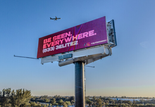
- High-Contrast Colors: Pair light text on dark backgrounds (or vice versa) for better visibility. Avoid hard-to-read combinations like red on blue.
- Strong Call-to-Action (CTA): Use action-oriented phrases like "Shop Now!" or "Get 25% Off Today" and make your CTA stand out with bold colors.
- Use Dynamic Content: Incorporate live data (like weather or countdowns) or subtle motion to make your billboard engaging.
- Stay On-Brand: Use your logo, brand colors, and consistent messaging to reinforce identity.
- Test and Improve: A/B test designs, track metrics like impressions and conversions, and adjust for better performance.
Why It Works:
- 400% more views compared to static billboards.
- 83% recall rate for digital ads.
- People are 71% more likely to notice a digital billboard than an online ad.
Quick Tips for Success:
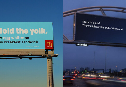
- Use 6 words maximum for your message.
- Add high-quality visuals that complement your text.
- Test your design in different lighting conditions for optimal readability.
These tips help you create digital billboards that capture attention, communicate effectively, and deliver results.
Best Practices for Billboard Design
1. Keep Design Clean
A clean design is crucial – viewers have just six seconds to understand your message. Keeping things simple improves readability and ensures your ad grabs attention in the fast-paced outdoor environment. Start by picking fonts that are easy to read and visually impactful.
Choose Big, Clear Fonts
Sans Serif fonts work best for outdoor ads because they’re easy to read from both close and far distances.
Here are some top font choices:
| Font Type | Best Uses | Key Benefits |
|---|---|---|
| Arial | Headlines & CTAs | Stands out from a distance |
| Helvetica | Main messaging | Clean and modern appearance |
| Verdana | Contact information | Great for digital clarity |
| Calibri | Secondary text | Readable even at smaller sizes |
For better readability, avoid ALL CAPS and ensure enough spacing between letters. Adding a dark outline to light-colored text can also make it pop against different backgrounds.
Use 6 Words Maximum
Billboards only get about six seconds of attention, so your message must be short and to the point. Stick to six words or fewer to ensure your message is clear. Focus on:
- One main idea
- Key contact details
- A single, strong call-to-action
Make Colors Stand Out
The right colors make your ad more visible. High contrast between text and background is essential, especially in varying light conditions.
Here’s how to make your colors work:
- Pair dark text with light backgrounds, or vice versa.
- Test your color combinations in different lighting.
- Consider the physical surroundings of your billboard.
- Use colors that are accessible for those with color blindness.
Colors like red, pink, and teal stand out well against black backgrounds. However, avoid pairing complementary colors (e.g., red and green) as they can create visual strain and reduce readability.
2. Design for Fast Reading
Digital billboards grab attention quickly – often within just 2–5 seconds. With 60% of consumers recalling digital billboards they’ve seen in the past week, it’s clear that making your message easy to read is key to success.
Focus on One Main Idea
Keep it simple. A cluttered billboard can confuse viewers, so stick to the basics. Here’s a quick guide:
| Message Component | Include | Avoid |
|---|---|---|
| Main Message | A single benefit or offer | Too many selling points |
| Supporting Info | Location or contact details | Overly detailed information |
| Call-to-Action | One clear step | Multiple actions or vague directions |
Your billboard should answer three questions: What are you offering? Why should people care? How can they take action? Use short, straightforward language, and pair it with a striking visual to make your message stand out.
Use Impactful Images
A strong image can make your message even more memorable. High-quality visuals help create emotional connections and make your billboard easier to understand. Digital billboards are the perfect platform for bold, attention-grabbing imagery. To make the most of them:
- Use one large, dominant image instead of several smaller ones.
- Scale images properly – too big can overwhelm, and too small might go unnoticed.
- Consider local culture and symbols when choosing visuals.
- Make sure your image complements your text, not competes with it.
When clear messaging and eye-catching visuals come together, your billboard will leave a lasting impression.
3. Use High-Contrast Colors
To make your billboard stand out and ensure your message sticks, focus on using high-contrast colors. Studies show that well-chosen contrasting colors can boost message recall by up to 38%.
Avoid Problematic Color Combinations
Not all color pairs work well on digital billboards. Some combinations can make your message hard to read. Here’s a quick guide to steer clear of common issues:
| Color Combination | Problem | Better Option |
|---|---|---|
| Green + Yellow | Low contrast | Yellow + Black |
| Red + Blue | Hard to read | Blue + White |
| Light text on light background | Poor readability | Dark text on light background |
| Red/Blue/Purple on black | Insufficient contrast | Use these colors on white |
Want to test your design? Convert it to grayscale in Adobe® Photoshop®. If any part of the design looks unclear, it likely lacks enough contrast.
Work Brand Colors Into Your Design
Once you’ve avoided tricky color combinations, the next step is to incorporate your brand colors effectively. Balancing brand identity with readability is key. For example, Daktronics uses the South Dakota State University Jackrabbits logo with blue and yellow, creating a design that’s both eye-catching and easy to read.
Here are some tips for using brand colors:
- Use a dark background to make colors pop.
- Stick to three dominant colors to keep the design clean.
- Test visibility under different lighting conditions to ensure readability.
sbb-itb-2e2e93f
4. Write Clear Call-to-Action
A strong call-to-action (CTA) can turn a casual glance at your billboard into real action. While clear design catches attention, a well-crafted CTA directs that attention toward a specific goal.
Use Action-Oriented Language
The right action words can make a big difference. For example, PartnerStack saw a 111.55% increase in conversion rates just by changing its CTA from "Book a Demo" to "Get Started".
Here are examples of effective CTA phrases for digital billboards:
| Purpose | Strong CTAs | Why It Works |
|---|---|---|
| Immediate Sales | "SHOP NOW!" "Get 25% Off Today" | Creates urgency and highlights value |
| Lead Generation | "Request Demo" | Offers a clear and memorable next step |
| Brand Awareness | "Follow @BrandName" | Encourages interaction on social platforms |
| Event Promotion | "Reserve Your Spot" | Suggests limited availability to drive action |
Once you’ve chosen the right words, make sure your design makes the CTA impossible to miss.
Make Your CTA Pop
Your CTA needs to grab attention immediately. Buddha Brands achieved this by placing their "Add To Bag" button on a contrasting background, ensuring it stood out.
Here are some tips to make your CTA more visible:
- Strategic Placement: Position the CTA in the lower third of the design, where viewers’ eyes naturally land.
- Use Contrast: If your design lacks bold colors like red, consider using them for the CTA to create instant visual impact.
- Create a Sense of Urgency: For example, FieldEdge used a high-contrast "Request Demo" button placed below key benefits to encourage quick action.
You can also test different CTA options. Exactera, for instance, uses two CTAs – "Book a demo" and "See the Overview" – giving viewers a choice in how they want to engage.
5. Add Live Content
Digital billboards have the power to display dynamic, real-time content that not only grabs attention but also drives action.
Show Live Data
Using real-time data can make your billboard more engaging and relevant. For instance, McDonald’s used digital billboards with weather-based promotions, which successfully increased foot traffic to nearby restaurants.
Here are some practical ways to use live data effectively:
| Data Type | Example Usage | Impact |
|---|---|---|
| Weather Updates | Rain-X ads during rainy weather | Boosted relevance and sales in wet conditions |
| Event Countdowns | NBA playoffs countdown timers | 25% increase in viewer intent to tune in |
| Temperature | Aperol ads when temperatures hit 66°F+ | Higher engagement during ideal weather |
| Social Media | Live tweets during sports events | 7% boost in brand awareness |
A standout example is British Airways’ "Look Up" campaign. They displayed real-time flight information on billboards in London’s Piccadilly Circus, connecting their ads to actual flights overhead. This creative approach significantly enhanced their brand visibility.
Add Simple Movement
Adding subtle motion can make your billboard even more eye-catching. Coca-Cola demonstrated this during the 2018 World Cup by using dynamic content that reacted to match events while keeping the message clear and visible.
Here are some tips for incorporating movement:
- Keep It Subtle: Use smooth transitions that enhance your message without overwhelming viewers.
- Time It Right: Adjust your content to match peak viewing times. For example, Guinness Australia’s "Brewery of Meteorology" campaign updated its ads based on weather changes to drive sales and visits.
- Align With Your Brand: Ensure any motion fits your brand’s identity. Vandebron, for instance, combined movement with its EV charging campaign to reinforce its sustainable energy message.
Simple, thoughtful motion can make your billboard stand out while staying true to your brand.
6. Match Your Brand
To make your billboard effective, it needs to align with your brand. This helps people recognize and trust your business more easily.
Include Brand Elements
Incorporate essential brand elements to create an immediate connection with viewers. Consistency in branding can increase revenue by 23%. Here’s how to do it right:
| Element | Best Practice | Example |
|---|---|---|
| Logo Placement | Keep the logo proportional and avoid distortion | Nike’s swoosh is always displayed without alteration |
| Color Scheme | Use RGB for vibrant digital displays | Google’s red, blue, yellow, and green colors |
| Typography | Stick to one or two brand fonts; ensure readability | Apple’s San Francisco font family for a clean look |
When adding your logo, make sure it’s noticeable but doesn’t dominate the design. Add dark outlines to text if needed for better visibility without losing brand alignment. Carry this consistent style across all platforms to strengthen your brand presence.
Match Other Marketing
Your billboard should work seamlessly with your overall marketing efforts. Using consistent visuals, messaging, and experiences across channels builds loyalty and reinforces your brand.
Here are a few ways to ensure alignment:
- Digital Integration: Link your billboard’s style to your digital channels. IKEA’s use of its blue-and-yellow branding is a great example.
- Seasonal Themes: Adjust your billboard’s content for seasons or events while keeping core brand elements intact.
- Unified Campaigns: Match billboard messaging with other marketing campaigns. Apple’s minimalist, cohesive designs are a prime example.
Create clear brand guidelines specifically for digital billboard use, and review your branding assets regularly to avoid inconsistencies. Misaligned branding can confuse your audience, as seen with some high-profile redesign failures.
7. Measure and Improve
Once your design is ready, the next step is testing its performance to see how it can be refined. Designing effective digital billboards isn’t a one-and-done process – it involves ongoing testing and making adjustments based on data. Modern tools allow you to track how well your billboard works, helping you tweak it for better results. This ties back to earlier points about design and messaging, ensuring your efforts are measurable and actionable.
Compare Different Versions
A/B testing is a great way to figure out what works best for your audience. By testing different designs, you can pinpoint the elements that resonate most. Here’s a quick breakdown of what to test and how to measure it:
| Test Element | What to Compare | How to Measure |
|---|---|---|
| Visual Design | Colors, layouts, images | Engagement tracking, brand recall |
| Message | Headlines, CTAs, word count | Response rates, conversion tracking |
| Timing | Display duration, dayparts | Traffic patterns, interaction rates |
Make sure to test each version under the same conditions for accurate comparisons. For example, platforms like Blip let advertisers try out multiple designs across different locations and monitor performance in real time.
Track Results
Keep an eye on these key metrics:
-
Impression Quality
Measure not just the number of views but also the quality of those impressions. Modern GPS and geolocation tools can track how engaged viewers are. Research shows that people exposed to out-of-home (OOH) ads are 17% more likely to interact with the brand on their mobile devices. -
Brand Impact
Studies reveal that 82% of people remember digital billboard ads they saw up to a month ago. Use surveys and social media listening to assess how your campaign affects brand awareness and public sentiment. -
Response Metrics
Add trackable features like unique QR codes or custom URLs to your billboards. According to the Outdoor Advertising Association of America, an average billboard generates between 30,000 to 50,000 impressions daily. Track how these impressions convert into actions or engagement.
Combine these billboard insights with data from other channels, such as website traffic, social media activity, direct responses, and local sales. Use this information to fine-tune your strategy and improve your campaign’s overall performance.
Conclusion: Design Tips Summary
Key Takeaways
Creating a powerful billboard design comes down to a simple formula: clean layout, bold fonts, and a clear message.
"Billboard design is a whole different type of design specialty in and of itself." – Nora Kramer, Designer + Brand Strategist
Here’s what you need to focus on for effective digital billboard design:
- Simple Layout: Stick to three main elements – headline, image, and call-to-action.
- Readable Typography: Choose bold, wide fonts that stand out from a distance. Black text on a yellow background is a great choice for visibility.
- Clear Messaging: Keep it short – seven words or fewer.
"An effective billboard communicates the message in seconds." – Chris Lottman, Director of Online Services at Whistler Billboards
These tips will help you craft a message that grabs attention and drives results.
Get Started on Your Campaign
Starting your billboard campaign doesn’t have to be complicated. Platforms like Blip Billboards make it affordable, with daily budgets starting as low as $20.
"Billboards are one of the most impactful ways to advertise, and with Blip, you spend a fraction of what you would end up paying elsewhere." – Ray Bowens, Founder, Hashtag-Vape
To ensure your campaign’s success, follow these steps:
| Step | Action | Key Focus |
|---|---|---|
| Design | Create an ad that fits specs | Ensure it’s clear and eye-catching |
| Location | Pick high-traffic spots | Align with your audience |
| Schedule | Set the campaign duration | Choose times for max visibility |
| Track | Monitor performance | Use tools like QR codes |
"Working with Blip has given Mr. Charlie’s the momentum to get our new location on the map while accelerating growth for our original location." – Paul Willey
Use these steps to make the most of your billboard investment and see measurable results.