Billboards give you just 5 seconds to grab attention. To make your design clear and effective, follow these key principles:
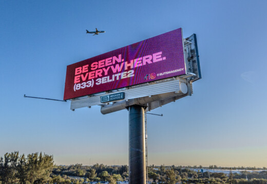
- Keep it short: Use 7 words or fewer for your message.
- Use large fonts: Text should be readable from 500 feet.
- High-contrast colors: Ensure text stands out against the background.
- Bold visuals: Stick to one main image that reinforces your message.
- Clear CTA: Make contact info and next steps easy to spot.
Pro Tip: Test your design by viewing it from different distances to ensure clarity. Use tools like Blip to refine your billboard and track its performance.
4 Tips For Eye-Catching Billboard Designs | Kimp
1. Write Clear Messages
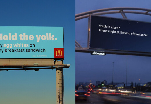
Billboard messages need to be quick and easy to understand – drivers only have a few seconds to take in the information.
Use 7 Words or Less
Stick to 7 words or fewer for your message. This keeps it easy to read and grasp. Prioritize:
- A single idea or call-to-action
- Active verbs to encourage action
- Only the most important details
Straightforward language ensures your message hits instantly.
Keep It Simple
It’s not just about word count – your language should also be easy to follow. Avoid complicated terms, industry-specific jargon, or overly clever wordplay that might confuse people.
The goal is to create a message that’s instantly clear while still reflecting your brand’s personality. Simplicity leads to stronger, more effective communication.
2. Make Text Easy to Read
When designing billboard text, it’s crucial to ensure drivers can read it quickly, even at high speeds. The right formatting makes all the difference.
Use Large, Clear Fonts
Opt for a sans-serif font, and make sure the letters are at least 24 inches tall. This ensures the text is legible from a distance.
Choose High-Contrast Colors
Pick text and background colors that stand out against each other, no matter the lighting conditions. This helps your message stay visible day or night.
These simple design choices ensure your billboard grabs attention and communicates effectively.
3. Design Strong Visuals
Visuals grab attention fast. A well-thought-out design ensures your message stands out and leaves a lasting impression.
Pick Bold Colors
Bold, high-contrast colors can make your billboard noticeable even in busy environments. When selecting colors, think about:
- Primary and secondary colors: These are naturally eye-catching and easy to recognize, even at high speeds.
- Background-text contrast: Make sure your text pops against the background without blending in.
- Weather and lighting conditions: Consider how your colors will look in various weather and at different times of the day.
Once your color choices are finalized, focus on a single, strong image to complement your message.
Focus on One Main Image
A single image is much more effective than cluttered visuals. Your chosen image should:
- Reinforce your message: Select an image that aligns with your core idea.
- Be visible from a distance: Ensure it’s clear and recognizable from over 500 feet away.
- Stay simple: Avoid unnecessary details that distract from the main point.
Blip works for us. It’s a different medium, and it brings a lot of exposure. That’s what I like
The goal is to keep your design simple yet impactful. Every element should work in harmony, helping viewers grasp your message instantly. Remember, most people will only glance at your billboard for a few seconds, so clarity is key.
sbb-itb-2e2e93f
4. Plan for Distance
Billboard designs need to grab attention quickly and be effective from far away, considering brief glances and varying speeds. Let’s break down the essential factors for making your billboard stand out.
Test Readability from 500 Feet
Your message should be clear and readable from as far as 500 feet. Here’s what to focus on:
- Font size: Use large text that’s easy to read from a distance.
- Contrast: Ensure text and background colors create sharp contrast.
- Image clarity: Graphics and logos should remain clear and recognizable, even from afar.
Design for a 5-Second Glance
Drivers typically have about 5 seconds to view your billboard. Your design needs to communicate instantly and effectively within that short time.
Key Design Elements for Quick Viewing
| Element | Purpose | Tips for Implementation |
|---|---|---|
| Message Length | Quick comprehension | Stick to 7 words or fewer. |
| Visual Hierarchy | Direct attention | Place the main message at the top or center. |
| Color Choices | Immediate recognition | Use bold, high-contrast colors. |
Your billboard competes with plenty of distractions – traffic signals, other vehicles, and road signs, to name a few. A clean, bold design ensures your message gets through.
Test your design by viewing it from various distances and angles to mimic real-world conditions. This will help you spot any elements that might be hard to read or understand at a glance. The goal? A billboard that’s clear, impactful, and unforgettable, even in just a few seconds.
5. Add Clear Next Steps
Your billboard’s call-to-action (CTA) should stand out just as much as your main message. It should guide viewers to act quickly and effortlessly.
Display Contact Info Clearly
Make sure your contact details are easy to read at a glance. Use large font sizes – at least one-third the size of your main message – and position them in the lower third of the design. High-contrast colors are key for visibility.
Format Tips
| Contact Type | Best Practice | Example |
|---|---|---|
| Phone Numbers | Use dots or dashes for clarity | 555.123.4567 |
| Keep addresses short and simple | [email protected] | |
| Physical Address | Include only if location-specific | Exit 24 & Main St |
Keep Web Links Simple
Web links should be straightforward and easy to remember.
Web Address Tips
- Drop "www" and "http://" from URLs
- Choose a domain name that’s easy to recall
- Use landing pages tailored to specific campaigns
CTA Guidelines
Use action-oriented words like "Visit", "Call", or "Stop By." Stick to one main CTA, make it visually distinct with contrasting colors, and test its readability from different distances.
For even better results, take advantage of Blip’s design tools to refine your billboard and maximize its impact.
6. Use Blip‘s Design Tools
Creating effective billboard ads is straightforward with Blip’s design tools and performance tracking features.
Stick to Blip’s Design Guidelines
Blip’s tools focus on clear messaging and bold visuals to help you craft ads that grab attention. Their design guidelines ensure your ads meet outdoor visibility standards, and the user-friendly online tools guide you step-by-step through the process.
Once your ad is ready and meets these standards, you can track its performance using Blip’s analytics tools.
Monitor Ad Performance
Blip provides real-time analytics, including impression counts, CPM metrics, and bidding updates, making it easy to adjust your campaigns as needed. Campaigns go through a quick two-step moderation process: an initial review within 90 minutes, followed by final approval from the billboard owner within 1–3 days. This ensures your ads go live without unnecessary delays.
Conclusion
Designing billboards that grab attention and communicate effectively requires focusing on key principles like clear messaging and striking visuals. Keeping your message short and using high-contrast designs can help ensure your ad connects with viewers quickly.
Blip works for us. It’s a different medium, and it brings a lot of exposure. That’s what I like
A successful billboard campaign blends straightforward messaging, eye-catching visuals, and smart placement to stand out. Blip’s tools and analytics make it easier for advertisers to create outdoor campaigns that engage their audience.
With Blip offering options starting at just $20 per day, these design tips make impactful advertising accessible. Use these principles to create billboard campaigns that leave a strong impression.