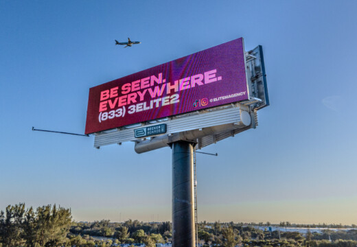
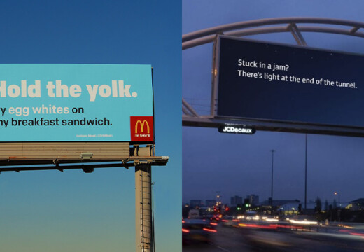
Want your billboard to stand out? Strong color contrast is the key to grabbing attention and ensuring your message is readable. Here’s the quick takeaway:
- High Contrast Boosts Recall: Studies show it can improve ad recall by up to 38%.
- Best Practices: Use dark text on light backgrounds (or vice versa), limit to 3 colors, and test designs in grayscale.
- Avoid These Combos: Light gray on white, yellow on white, or dark blue on black.
- Day vs. Night: Opt for bold colors during the day and darker backgrounds at night for better readability.
- Test Your Design: Check under different lighting, distances, and even simulate color blindness for accessibility.
Quick Comparison of Effective Color Pairs:
| Background Color | Text Color | Visibility Impact |
|---|---|---|
| Black | Yellow | Excellent contrast and readability |
| Dark Blue | White | Professional and easy to read |
| Red | White | Bold and attention-grabbing |
| Yellow | Black | Highly visible in daylight |
Tip: Grayscale testing and tools like WebAIM Contrast Checker can ensure your design is clear and impactful in all conditions. Ready to make your billboard pop? Let’s dive into the details.
Best Colors For Billboards
Problems with Weak Color Contrast
Weak color contrast can make your billboard less noticeable and reduce the impact of your message.
Distance Visibility Issues
Visibility from a distance is crucial, especially on highways and busy roads where drivers have only seconds to absorb information. If your text and background colors are too similar, key details may become hard to see. To avoid this, aim for at least a 70% brightness difference between text and background . Without enough contrast, your billboard risks blending into its surroundings.
Text and Image Clarity Challenges
Several factors can affect the clarity of text and images on your billboard:
- Color vibration: Certain color pairings can blur edges, particularly on digital displays .
- Lighting conditions: Daylight and nighttime lighting can alter how colors appear, impacting readability .
- Digital display issues: Bright white backgrounds may emit too much light, making text harder to read despite their brightness .
Here’s a quick look at common problematic color combinations and their effects:
| Color Combination | Visibility Issue | Impact on Readability |
|---|---|---|
| Light gray on white | Minimal contrast | Nearly impossible to read from a distance |
| Yellow on white | Color blending | Message fades into the background |
| Dark blue on black | Insufficient contrast | Text becomes hard to distinguish |
To catch these problems early, convert your design to grayscale – this can quickly highlight weak contrast areas . Additionally, testing your billboard under various lighting conditions ensures it remains readable throughout the day and night . Testing in different environments is key to making smart color choices.
Basic Rules for Strong Color Contrast
Strong color contrast is essential for overcoming visibility and readability challenges in billboard design.
Color Theory and Light-Dark Balance
A good billboard design relies heavily on the balance between light and dark colors. The key is to create enough tonal contrast between elements to ensure they stand out.
"Contrast is Key. Use high contrast between text and background to ensure readability, especially from a distance. Dark text on a light background or vice versa tends to be more legible." – Penneco Outdoor Advertising
Here are some practical tips to guide your color choices:
| Contrast Element | Best Practice | Impact on Visibility |
|---|---|---|
| Text vs. Background | Use strong tonal contrast | Improves readability from a distance |
| Color Palette | Limit to 3 dominant colors | Keeps the design clean and focused |
| Background Selection | Opt for backgrounds that complement text | Reduces eye strain and aids clarity |
| Environmental Context | Choose colors that stand out in the location | Increases visibility on-site |
Big brands like Coca-Cola and McDonald’s are great examples of this. Coca-Cola pairs its red background with white text for a bold, readable design . McDonald’s uses yellow arches against red or black backgrounds to grab attention and reinforce its branding .
To double-check your choices, convert your design to grayscale. This ensures the contrast is strong enough to make all elements distinct.
Testing Contrast with Grayscale
Grayscale testing is a simple but effective way to evaluate the strength of your color contrast. By removing color, you can focus solely on the light and dark values in your design. If the text or key features blend into the background, the contrast needs improvement.
Here’s how to test your design:
- Create your billboard using your chosen colors.
- Convert the design to grayscale in your design software.
- Check that text and important elements remain distinct.
- Adjust the color values if any parts appear too similar in gray tones.
"To make it simple, contrast refers to the difference between light and dark." – Daktronics
For the best results, test your design under different conditions:
- Lighting: Morning, afternoon, and evening light can affect visibility.
- Weather: Consider sunny, cloudy, and rainy scenarios.
- Viewing Distance: Ensure the design is clear from both close-up and typical billboard distances.
- Accessibility: Simulate color blindness to confirm the design is inclusive.
These steps will help you create a billboard that stands out and communicates effectively, no matter the environment.
sbb-itb-2e2e93f
Best Color Pairs and Design Guidelines
Most Effective Color Combinations
High contrast is key for making billboards stand out. Grayscale testing confirms that strong contrast improves visibility, and studies show it can boost ad recall by up to 38% .
| Background Color | Text Color | Visibility Impact |
|---|---|---|
| Black | Yellow | Excellent contrast and readability |
| Dark Blue | White | Professional and easy to read |
| Red | White | Bold and attention-grabbing |
| Dark Purple | White | Luxurious feel with clear contrast |
| Yellow | Black | Highly visible, especially in daylight |
Pairing complementary colors with noticeable tonal differences enhances readability. Warm colors like red, orange, and yellow convey energy and urgency, while cooler tones like green, blue, and purple communicate calmness, trust, or sophistication . The right combinations can make your message pop, while poor choices can dilute its impact.
Color Combinations to Skip
Not all color pairings work. Some can reduce visibility and make your design harder to read. As AnchorPointe Graphics puts it:
"The higher the contrast, the more visible and eye-catching your colors will be together." – AnchorPointe Graphics
Here are some combinations to avoid:
- Light blue text on white backgrounds
- Dark text on dark backgrounds
- Red and green with similar tonal values
- Neon or overly bright pairings
- Pastel-on-pastel combinations
Day and Night Visibility Tips
To ensure your billboard is clear in all lighting conditions, keep these tips in mind:
Daytime Visibility:
- Use bold, saturated colors for digital displays .
- Prioritize high-contrast color combinations.
- Account for surroundings and backdrop colors.
- Stick to three dominant colors to avoid clutter .
Nighttime Visibility:
- Avoid white backgrounds on digital screens to reduce glare .
- Opt for dark backgrounds to improve readability.
- Save white or pastel designs for daytime use .
Test your designs under different lighting scenarios to ensure your message remains clear and effective, day or night.
Digital vs. Print Billboard Contrast
Digital Screen Contrast Settings
Digital billboards come with their own set of challenges because they produce light rather than relying on ambient light. As Melody Roberts from Out of Home Creative explains:
"With digital, colors such as red, pink, and teal contrast against black, offering rich vibrancy" .
To ensure readability, digital screens need brightness adjustments – brighter during the day to compete with sunlight and dimmer at night to avoid glare . To improve text clarity, use a thin dark stroke around letters and steer clear of white backgrounds, which can cause harsh glare .
Print Billboard Contrast Factors
Printed billboards face a completely different set of challenges since they rely entirely on ambient light. Their visibility depends on factors like surrounding colors, textures, and lighting conditions . Designers should use bold, saturated colors to make printed billboards pop against urban or rural settings . Thick lines for text and graphics also help improve legibility . Unlike their digital counterparts, printed billboards can’t emit light, so their design must account for how ambient light interacts with the chosen colors and contrast ratios .
Color Contrast Tools and Help
Contrast Testing Tools
The WebAIM Contrast Checker is a handy tool for testing color HEX values against accessibility standards, specifically WCAG 2.1. It ensures compliance with the required contrast ratios: 4.5:1 for regular text and 3:1 for larger text .
The Colour Contrast Analyser (CCA) allows you to evaluate screenshots, making it useful for checking existing designs . Another option is the Polypane Contrast Checker, which combines WCAG standards with the Adjusted Perceived Contrast Algorithm (APCA) to assess visibility under various viewing conditions .
While automated checks are helpful, don’t skip manual testing to see how your designs perform in real-world settings.
Design Testing Methods
Converting your design to grayscale is a simple yet effective way to evaluate tonal contrast. This approach focuses on the brightness differences between elements, rather than just their colors, ensuring your design remains clear in various environments . It’s a great complement to automated testing tools.
Blip Design Support
If you’re looking for expert help, Blip provides design support tailored for advertisers. Their platform offers:
- Design guidelines that prioritize bright colors and strong contrast
- A free, instant design tool with pre-tested templates
- Templates compatible with Canva and Adobe software
- Automatic resizing for billboard dimensions
Blip also suggests keeping text to seven words or fewer and using bold, easy-to-read fonts. Their moderation team reviews submissions within 90 minutes to ensure your designs meet visibility standards before they go live.
Conclusion: Creating Clear, Visible Billboard Designs
Color contrast plays a major role in billboard design. As Penneco Outdoor Advertising puts it:
"Contrast is key"
The idea is straightforward: dark text on light backgrounds or light text on dark backgrounds ensures easy readability.
For digital billboards, bold and saturated colors often outperform white or pastel tones . This approach proved effective in McDonald’s 24-hour service campaign, where they used bright yellows during the day and deep blues at night, keeping the contrast sharp no matter the time .
A quick way to check your contrast is to convert your design to grayscale and aim for a contrast ratio of 4.5:1 or higher . But don’t stop there – real-world testing is a must. Your design needs to hold up under different lighting conditions and when viewed from various distances.
To make this process easier, Blip offers design guidelines and pre-tested templates, helping advertisers create high-contrast designs without needing advanced skills. Plus, their 90-minute review process ensures your billboard is ready to grab attention before it goes live.


