Digital billboards can boost your brand’s visibility, but common mistakes can ruin their impact. Here’s what you need to know to avoid them:
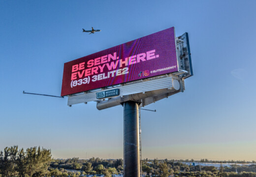
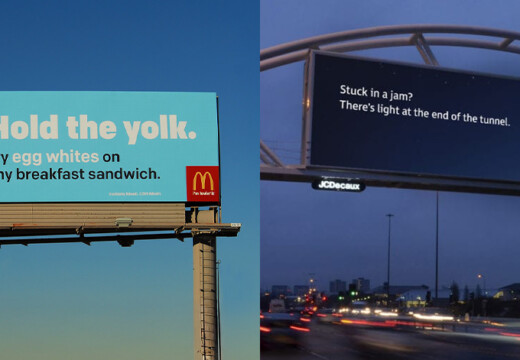
- Keep It Simple: Avoid overcrowding with too much text or information. Use a single, clear message and limit text to 7–10 words.
- Readable Design: Use high-contrast colors, large fonts, and simple layouts to ensure visibility from a distance.
- Right Placement: Consider traffic speed, viewing angles, and location to maximize exposure.
- Consistent Branding: Stick to your brand’s colors, fonts, and tone to maintain recognition.
- Strong Call-to-Action (CTA): Make your CTA clear, concise, and actionable, like “Visit Us Today” or “Call Now.”
Information Overload on Billboards
Too Much Content
One frequent error with digital billboards is cramming them with too much information. Unlike social media or print ads where people can take their time, billboard viewers only have a few seconds to catch your message. Adding multiple phone numbers, website links, social media handles, or long descriptions creates clutter that dilutes the bold impact a billboard should deliver.
This issue is especially problematic with digital billboards because:
- Drivers and passengers are usually in motion.
- Lighting conditions can make text harder to read.
- Competing messages vie for limited attention.
- Complex designs take longer to process.
The solution? Stick to a clear, single message.
Keep it Simple
Simplicity is key. A digital billboard should convey one main idea that’s instantly understood. This approach has worked well for businesses like Pretty In Pinkston. Owner Kimberly Pinkson shares her experience:
"Blip works for us. It’s a different medium, and it brings a lot of exposure. It sets us apart from the rest of the [competition], and that’s what I like." – Kimberly Pinkson, Owner, Pretty In Pinkston
Here are some tips for effective billboard design:
- Use a maximum of 7–10 words.
- Focus on one goal: brand awareness, location, or promotion, with a single contact option.
- Highlight the main message with larger, bold text.
Think of your billboard as a bold statement, not a detailed ad. Ray Bowens, Founder of Hashtag-Vape, emphasizes the value:
"Billboards are one of the most impactful ways to advertise, and with Blip, you spend a fraction of what you would end up paying elsewhere." – Ray Bowens, Founder, Hashtag-Vape
Design and Text Mistakes
Poor Color and Text Choices
Design errors on digital billboards can make your message ineffective. Bad color combinations or overly decorative fonts can hurt readability, especially for people viewing the billboard while in motion. Low contrast between text and background further reduces visibility.
Here are some common issues:
- Light text on light backgrounds makes reading difficult.
- Overly decorative fonts can be hard to decipher.
- Text that’s too small becomes unreadable from a distance.
- Clashing colors create visual distractions.
Clear Design Standards
You can avoid these pitfalls by sticking to proven design principles. These guidelines can help you create visuals that are clear and impactful:
| Design Element | Best Practice | Why It Works |
|---|---|---|
| Color Contrast | Use high contrast between text and background | Makes the text easy to read from far away |
| Font Selection | Stick to simple, sans-serif fonts | Ensures clarity from different viewing angles |
| Text Size | Use large, bold text | Allows quick comprehension, even at a glance |
Always test your design in real-world conditions. What looks good on a computer might not translate well to a massive billboard seen from a moving vehicle.
The best billboard designs rely on strong contrast, bold and simple fonts, plenty of white space to reduce clutter, and text that’s large enough to grab attention immediately.
Digital Signage Fails | Big Mistakes to Avoid | Tips & insights
Location and Viewing Factors
Location plays a major role in how effectively your message reaches its audience.
Speed and Distance Challenges
Where a billboard is placed directly impacts how well people can process its message. On fast-moving highways, drivers have only a split second to take in what they see.
Key factors that influence visibility include:
- Viewing Time: Faster vehicle speeds mean less time for drivers to engage with your ad.
- Reading Distance: The point at which your message becomes readable affects how much of it people can absorb.
- Angle of Approach: Billboards positioned at sharper angles are typically visible for shorter periods.
- Traffic Patterns: Variations in traffic flow can either increase or decrease exposure time.
Your design needs to address these challenges by delivering the message quickly and clearly.
Tips for Quick and Clear Design
To ensure your billboard is effective, focus on simplicity and readability. Here are some design tips:
- Use high contrast to make the text stand out.
- Choose large lettering that’s easy to read from a distance.
- Leave plenty of white space to keep the layout clean and uncluttered.
Tailor the design to fit the location. In urban areas with slower traffic, you can include a bit more detail. On highways, stick to bold, simple messaging for maximum impact. These thoughtful adjustments will help your brand stand out, no matter where the billboard is placed.
sbb-itb-2e2e93f
Brand Message Inconsistency
Once you’ve nailed down the design and placement, the next step is keeping your brand message consistent.
Consistency helps your audience recognize and remember your brand. When your messaging shifts between displays, it can confuse viewers and weaken your overall impact.
Mixed Brand Elements
Inconsistent elements can hurt the effectiveness of your advertising:
- Visual Identity Issues: Using different logos, colors, or fonts makes your brand harder to recognize.
- Tone Shifts: Switching between formal and casual messaging creates a disconnect with your audience.
- Design Differences: Changing layouts across displays makes your ads less memorable.
To avoid these pitfalls, it’s crucial to have clear standards in place.
Brand Guidelines
Clear brand guidelines are essential for maintaining your identity. Standardize the following:
- Colors: Define your primary and secondary brand colors.
- Logos: Set rules for placement and size.
- Fonts: Choose font families and establish a text hierarchy.
- Images: Specify the style of images to use.
- Voice and Tone: Keep your messaging aligned with your brand’s personality.
Here’s how to put these guidelines into action:
- Ensure visual consistency across all digital billboards.
- Stick to your brand standards in every campaign.
- Use repeated design elements to create recognition.
- Align all messaging with your established brand voice.
"Billboards are one of the most impactful ways to advertise, and with Blip, you spend a fraction of what you would end up paying elsewhere", says Ray Bowens, Founder of Hashtag-Vape.
Call-to-Action Problems
Once your design and messaging are aligned, the final piece is getting your audience to take action. Without a strong call-to-action (CTA), viewers won’t know what to do next.
Weak Action Prompts
Some common mistakes with CTAs include:
- Overloading with too much information, making it hard to process.
- Vague directions like "Learn More" without explaining what happens next.
- Failing to provide clear contact options or methods.
- Offering too many choices, such as "Call, Visit, Email, or Text", which can overwhelm viewers.
- Poor placement or design, like CTAs that blend into the background or use unreadable fonts.
These errors reduce the likelihood of engagement. To avoid this, make your CTA as straightforward and focused as your overall message.
Effective CTAs
To create a strong call-to-action, keep these tips in mind:
- Use brief, memorable contact info like simple web addresses or phone numbers.
- Position your CTA so it stands out visually.
- Choose action-driven language that clearly states what you want the audience to do.
- Add urgency with time-sensitive phrases like "Today Only."
- Ensure the design uses high contrast and readable fonts for better visibility.
"It’s not a social media thing that you see on your phone. It’s not word-of-mouth. It’s big and bold and out there in public. I would say this is the first step of looking big and public." – Chris Leslie, Founder, Leslie Lightcraft Co.
Digital billboard viewers only have a few seconds to absorb your message. Your CTA needs to be clear, immediate, and easy to remember, even after they’ve moved on.
A well-crafted CTA ties together your digital billboard campaign, enhancing the bold message of your design, location, and branding. It gives your audience a clear path to connect with your business.
Blip‘s Billboard Solutions

Blip tackles the challenges of digital billboard advertising with a suite of practical tools and resources designed to simplify the process and deliver results.
Affordable Advertising Options
Digital billboard advertising has often been seen as expensive, but Blip changes that with its pay-per-play model. Starting at just $0.01 per display and daily budgets as low as $20, businesses of all sizes can now access premium billboard spots. Ray Bowens underscores the affordability, noting that businesses can advertise for a fraction of the cost of traditional methods.
Key pricing features include:
- No minimum spending requirements
- No long-term contracts
- Real-time bidding every 10 minutes for competitive rates
- Payment only for actual ad displays
Design Assistance
To help advertisers avoid common design errors, Blip offers a range of resources to ensure ads are clear and effective. These include:
| Resource | Purpose | Benefit |
|---|---|---|
| Step-by-Step Guides | Walkthrough for campaign setup | Reduces setup mistakes |
| Video Tutorials | Visual instructions | Provides clear examples of best practices |
| Design Guidelines | Standards for billboard ads | Ensures ads are visible and readable |
| Two-Step Moderation | Quality control process | Ensures professional ad quality |
The moderation process is quick and thorough. Initial reviews are completed within 90 minutes, followed by final approval from the billboard owner within 1-3 days. This ensures high-quality ads while keeping campaign launches on schedule.
Campaign Management Made Easy
Blip’s platform gives advertisers full control over their campaigns. With an intuitive interface, users can:
- Choose billboard locations using metrics like impressions and CPM
- Monitor performance with detailed analytics
- Make real-time adjustments to campaigns
- Target specific audiences by location
These tools make it easy to manage every aspect of a campaign, from start to finish, while avoiding the usual hurdles of digital billboard advertising.
Conclusion
Digital billboards provide brands with public exposure, but success hinges on avoiding common mistakes and using effective strategies.
Here’s a quick breakdown of key areas to focus on for impactful billboard campaigns:
| Key Area | Common Mistake | Solution |
|---|---|---|
| Content Design | Overloading information | Keep messages clear and to the point |
| Visual Elements | Poor readability | Use high-contrast, easy-to-read designs |
| Brand Consistency | Mixed messages | Stick to unified brand guidelines |
| Call-to-Action | Weak or missing CTAs | Add clear, actionable prompts |
These straightforward tips can guide brands toward creating effective billboard campaigns. A great example comes from Paul Willey, Owner of Mr. Charlie’s Chicken Fingers, who shared:
"Working with Blip has given Mr. Charlie’s the momentum to get our new location on the map while accelerating growth for our original location".
Digital billboards have become an accessible option for businesses of all sizes, no longer reserved for massive budgets. By focusing on these strategies, brands can make the most of their outdoor advertising efforts and see real results.


