- Daytime designs need bold colors, high contrast, and large fonts to combat sunlight and glare.
- Nighttime designs rely on dark backgrounds, bright text, and controlled lighting to stay visible without distracting drivers.
- Digital billboards let you adjust content automatically for different times of day, ensuring maximum impact.
Quick Comparison:
| Design Element | Daytime Requirements | Nighttime Requirements |
|---|---|---|
| Contrast | Dark text on light backgrounds | Light text on dark backgrounds |
| Color Usage | Bold, saturated colors | High-contrast, illuminated colors |
| Text Size | Larger to counter sun glare | Slightly smaller due to controlled light |
| Background | Matte finishes to reduce glare | Dark tones to boost visibility |
LightDirect: The Neighborhood-Friendly Digital Billboard
Daytime Billboard Design Requirements
Daytime billboards must overcome intense sunlight, which affects visibility and demands specific design strategies.
Sunlight Effects on Visibility
Bright sunlight often causes glare on billboard surfaces, making it harder to see the content. To counter this, digital billboards use anti-reflective coatings and brightness controls. Weather conditions can also impact contrast and shorten viewing distances. To combat these issues, designs prioritize high contrast and bold visual elements.
Best Color Choices for Daytime
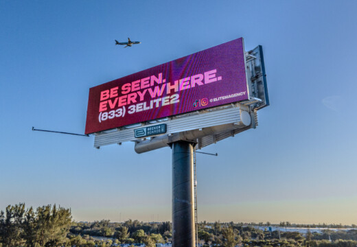
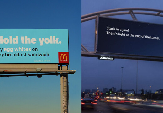
For better readability, stick to high-contrast color combinations – like dark backgrounds paired with bright text. Avoid light backgrounds, as they can amplify glare and make the content harder to see.
Text Size and Font Guidelines
Legible text starts with large, simple fonts. Sans-serif typefaces with increased letter spacing work best for readability from afar. Medium or bold font weights help text stand out in bright conditions. Using high-resolution displays ensures the text remains sharp and clear.
Nighttime Billboard Design Requirements
Designing billboards for nighttime comes with its own set of challenges, especially when it comes to lighting. The goal is to create ads that are clear and attention-grabbing without being a hazard to drivers.
Billboard Lighting Methods
Lighting plays a crucial role in nighttime billboard visibility. Digital billboards adjust their brightness to match the surrounding light, ensuring they’re neither too dim nor overly bright. Traditional billboards rely on external lighting, which should evenly illuminate the ad while avoiding glare that could distract drivers.
Managing Brightness Levels
Getting the brightness right is key. It needs to be bright enough for visibility but not so intense that it distracts or blinds drivers. Features like automatic dimming and carefully adjusted contrast settings help maintain this balance while also saving energy.
Choosing Colors for Nighttime
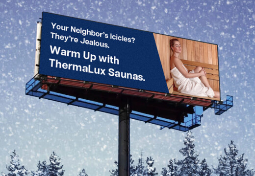
For nighttime readability, dark backgrounds paired with bright, contrasting text work best. This combination ensures the content is easy to read without straining the eyes, making it an effective approach for after-dark advertising. These choices also highlight the differences between designing for night and day.
sbb-itb-2e2e93f
Day vs. Night Design Comparison
To create effective 24-hour billboard advertising, it’s important to understand how design needs change between day and night. Each time period comes with its own set of challenges that require specific design strategies.
Light and Dark Balance
Contrast plays a big role in billboard readability. During the day, darker text on light backgrounds works best to stand out against bright sunlight. At night, the opposite is true – light text on dark backgrounds helps minimize glare while staying easy to read.
Light Source Differences
The type of lighting changes drastically from day to night. In daylight, billboards rely on natural sunlight and its reflections. At night, artificial lighting – like LED displays or floodlights – becomes the main source, requiring careful adjustments to ensure even illumination.
Time-Based Content
Digital billboards open the door for time-specific content. For example, a restaurant might display vibrant food imagery during the day to catch lunchtime crowds, then switch to glowing storefront visuals with hours of operation in the evening.
"Blip works for us. It’s a different medium, and it brings a lot of exposure. It sets us apart from the rest of the [competition], and that’s what I like." – Kimberly Pinkson, Owner, Pretty In Pinkston
Here’s a quick look at how design needs differ:
| Design Element | Daytime Requirements | Nighttime Requirements |
|---|---|---|
| Contrast | Dark text on light backgrounds | Light text on dark backgrounds |
| Color Usage | Bold, saturated colors | High-contrast, illuminated colors |
| Text Size | Larger to counter sun glare | Slightly smaller due to controlled light |
| Background | Matte finishes to reduce glare | Dark tones to boost visibility |
Design Tips for 24-Hour Visibility
Creating billboards that stand out around the clock takes careful planning and smart adjustments. By leveraging digital tools, you can adapt your ads to fit different lighting conditions seamlessly.
Scheduling Digital Content
Use digital platforms to schedule your content for optimal visibility. During the day, opt for brighter visuals that can cut through sunlight. After sunset, switch to darker designs with illuminated elements. These transitions ensure your billboard remains effective no matter the time of day.
Visibility Adjustments
Tailor your designs to match the lighting conditions:
- Dawn/Dusk: Medium contrast with bold elements works best.
- Midday: Light backgrounds paired with dark text improve readability.
- Night: Dark backgrounds with bright, light-colored elements stand out.
- Overcast Days: Neutral, high-contrast visuals perform well.
Automated brightness controls can help keep your designs sharp and clear as conditions change.
Design Testing Methods
Testing your designs under different circumstances is essential to ensure they work as intended. Here’s how to do it:
- Digital Preview: Check your designs on calibrated screens with varying brightness levels to identify any contrast issues.
- Time Analysis: Review how your designs perform at different times – early morning, midday, evening, and night.
- Distance Check: Test visibility from various angles and distances to confirm your billboard grabs attention from every vantage point.
"Billboards are one of the most impactful ways to advertise, and with Blip, you spend a fraction of what you would end up paying elsewhere." – Ray Bowens, Founder, Hashtag-Vape
Conclusion
Designing billboards requires careful attention to how they appear in different lighting conditions, whether it’s bright daylight or the dark of night. The contrast between these environments means advertisers need to adjust elements like color choices, contrast, and layout to maintain visibility and clarity. Thanks to digital billboard technology, these adjustments can now happen automatically, ensuring your ad looks great around the clock.
Platforms like Blip make managing dynamic billboard content easier than ever, with campaigns starting at just $20 per day. This allows businesses to maintain visibility 24/7 without breaking the bank.