6 Easy Tips for Effective Billboard Design
Getting the most bang for your buck while advertising is important. That’s why it’s vital for your Blip billboard ad to have a well-planned design that is right for both the medium and your customer. With billboards, you have about six to eight seconds to get your message across to drivers, so taking time to “sweat the small stuff” will make a huge impact on your return of investment. These quick and easy guidelines will help you design the big, bold ad you need to make the right impression in the right amount of time.
1. Memorable Messaging
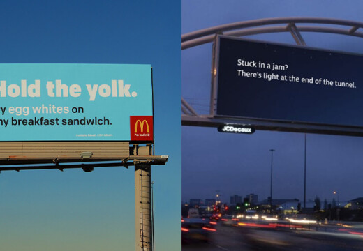
An entertaining campaign is a memorable campaign, but your main goal is always to be clear over clever. Complex visuals and wordplay, as well as industry jargon, may confuse your audience, especially when they only have several seconds to absorb your ad. Use images, fonts, and tried-and-true design practices together to create a smart and unforgettable message.
2. Message Length
Short messaging is more memorable and effective when it comes to billboard ads. In fact, most drivers will stop reading after about five or six words. Your goal is to curate every single word in the ad to convey your core message rather than focusing on fleshing out a detailed message with prose. To make a big impact, take the time to plan, edit, and re-edit your message to be as concise as possible.
3. Image Selection
Billboards are fundamentally a visual experience, and less is more when it comes to choosing your hero image. Your best practice will be choosing one image or graphic element that grabs your audience’s attention and reinforces the core message of your ad. When your image and text are unified, your reader will get one immediate and clear message in a matter of seconds.
4. Color Choices
With digital billboards, you want to attract the attention of your audience without distracting them or making them work too hard to read your ad. Sometimes this fine line comes down to color choices for the background paired with the text of your ad. The most important thing to think about is choosing background and font colors that contrast enough so your messaging is easy to read at any time of day. As a best practice, avoid bright white backgrounds, which can be especially distracting to drivers at night.
5. Font Size & Style Design
When it comes to fonts, don’t get fancy. Cursive lettering or script fonts are harder to read on the go, so keep your fonts big and bold. With serif or sans serif print, you’ll still have plenty of choices when you’re picking a font that matches your messaging and your brand. Whatever font you choose, it’s best practice to choose a single font within an ad. Change font size or bold part of the font to create a hierarchy of information or other variation within your message.
6. Contact Information
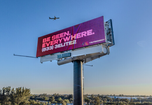
While it’s important for customers to know how to get in contact with your company, it should not be the main focus of a billboard ad per se. Choose other ad mediums for conversations and direct contact with customers, and use outdoor advertising to build brand recognition and to support a larger and varied advertising campaign. If you provide contact information within your ad, a short URL will be more memorable and effective than a phone number.
Refer to our Design Guidelines page to make sure your ad follows the specific rules for advertising with Blip. If you want hands-on help with the design of your ad, visit our Design Services page.


