Print vs Billboard Ad Design
If you own a small business, your advertising budget is no joke. The bread-and-butter of small business advertising tends to be in a print ad for a few reasons. First, they are generally more affordable; second, you have many publication placement choices to target markets; and third, it’s easy to control your budget.
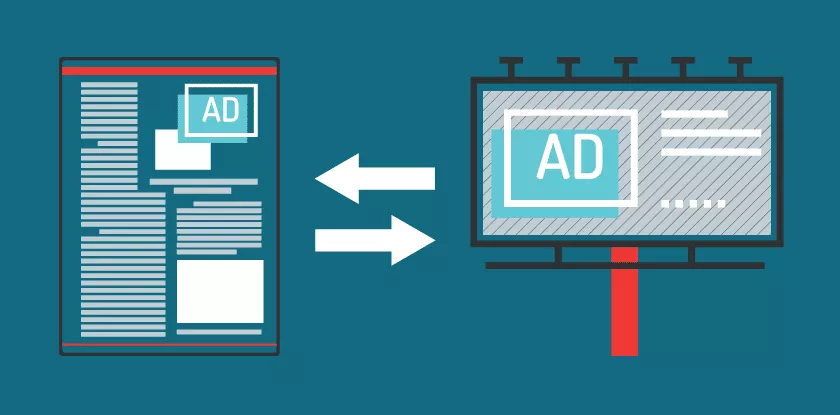
If you’ve got a print ad ready to run, we’ve got the tips and tricks you’ll need to turn your print ad into an effective billboard that will support your marketing campaign as a whole. Here are six basic things to keep in mind when converting the message of your print ad into a billboard ad design. (See graphic example below.)
- Consistency: Your design choices should stay in line with your existing branding, like logos and signature colors, of course. Additionally, keep colors, fonts, images, and themes the same across each advertising channel during an ad campaign.
- White Space: Billboard ads need much more white space than print ads to make your message easy to read and digest in a matter of seconds.
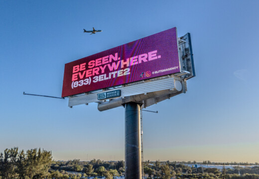
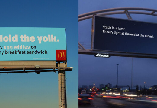
- Messaging: Cut your messaging on your billboards down to five or six words tops. This helps drivers digest what you’re trying to say in the seconds it takes to drive by.
- Fonts: Going hand-in-hand with messaging, big, non-script fonts are key for readability on the highway.
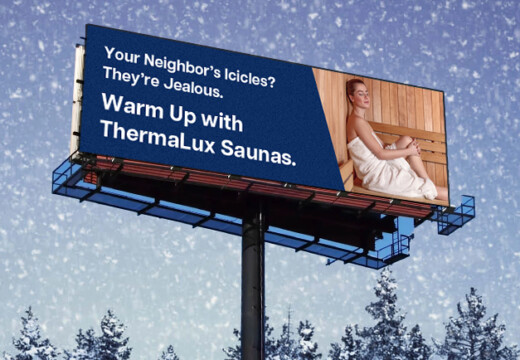
- Colors: Background and font colors should be in high contrast for readability. This is true in a print ad, but it’s especially true for billboard advertising. (Pro tip: No bright white backgrounds! They distract rather than attract drivers’ attention.)
- Contact Info: Since drivers have to remember how to contact you, use only one memorable contact method on a billboards. Often, your company’s name will be enough for customers to find out more if you have an online presence. A short URL or hashtag generally works well too.
Print Ad Design
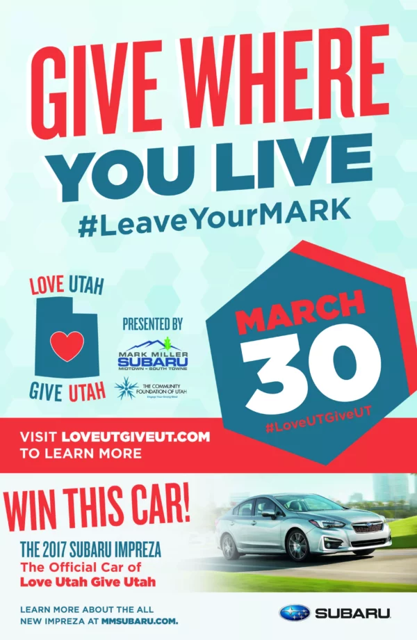
This print ad is packed with information that customers can digest at their own pace. It includes more detailed information and small print.
Billboard Ad Design

Converted to a billboard ad design, the messaging is cut down to a logo, the “Win me!” message, and what is winnable. The colors and fonts stay the same, but the fonts and logo are much larger to help with readability on the road.
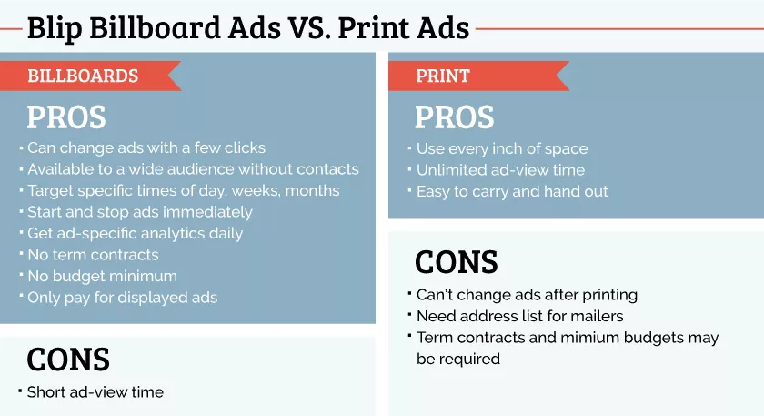
Learn more about creating an effective billboard ad design by clicking here and here.
Or let Blip help you make a great design for only $99 by clicking here.
