Billboards need bold, easy-to-read fonts that grab attention fast. To design effective billboard text, follow these key tips:
- Use high-contrast colors (e.g., black on yellow or white on dark blue) for better visibility.
- Choose simple, readable fonts like Helvetica Neue, Futura, or Impact for headlines.
- Prioritize font size hierarchy – make headlines the largest text, with minimal fine print.
- Test readability in different conditions, like sunlight or while moving.
Best Fonts for Billboards
- Sans-Serif for Headlines: Helvetica Neue, Futura, Arial Bold.
- Display Fonts for Impact: Impact, Knockout, Trade Gothic.
- Serif for a Classic Look: Clarendon, Rockwell.
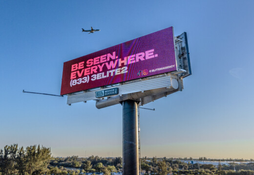
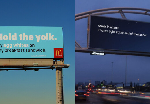
Keep your message short (five words or fewer) and avoid decorative fonts that reduce clarity. For maximum impact, ensure your design stands out at a glance.
Basic Rules for Billboard Typography
Creating Clear Text Contrast
To grab attention quickly, use high-contrast color combinations. Here are a few effective examples:
- Black text on white or yellow backgrounds
- White text on dark blue or black backgrounds
Stay away from low-contrast color pairs, as they make text harder to read. In bright settings, boost contrast even further to ensure clarity. Additionally, adjust text size and weight to emphasize the most important information.
Creating a billboard and postcard advertisement (Video 4)
Best Fonts for Billboard Design
Choose fonts that ensure clear communication and establish a visual hierarchy for your message.
Sans-Serif Fonts for Headlines
- Helvetica Neue: Its clean, simple design ensures text remains readable, even at high speeds.
- Futura: The geometric shapes make it easy to recognize from a distance.
- Arial Bold: Familiar and easy to process quickly, perfect for grabbing attention.
Display Fonts for Bold Statements
- Impact: Thick, bold letters and tight spacing make it stand out instantly.
- Knockout: Offers a variety of weights, allowing for striking contrasts.
- Trade Gothic: Its condensed design works well in tight spaces while staying easy to read.
Serif Fonts for a Classic Look
- Clarendon: Adds a touch of personality with bold serifs that are still easy to read.
- Rockwell: Slab serifs give it a strong, commanding presence, especially on simple backgrounds.
Up next, we’ll guide you on choosing the right font for your campaign’s specific needs.
sbb-itb-2e2e93f
How to Pick the Right Billboard Font
When deciding on a font for your billboard, focus on three key factors: readability, hierarchy, and how well it stands out in real-world conditions.
Prioritize Readability
Pick a font that’s clear and easy to read, even when people are moving quickly or viewing it from far away. Avoid overly fancy or intricate designs that might confuse the eye.
Establish Font Size Hierarchy
Your headline should stand out the most – make it the largest text on the billboard. Supporting text can be smaller but still easy to read. Keep fine print to a minimum and ensure it’s legible.
Test Visibility in Real-World Scenarios
Before you commit to a design, put it to the test in different conditions:
- Check how it looks both up close and from a distance.
- Imagine it being read by drivers at typical speeds.
- Evaluate its clarity in bright sunlight, dim lighting, and various weather conditions.
Tips for Better Billboard Text
When it comes to creating effective billboard copy, clarity and brevity are key. Here’s how to make your message stand out:
Write Less, Say More
Drivers only have a few seconds to read your billboard – usually no more than five words. Keep your message short and focused:
- Cut out unnecessary words.
- Stick to five words or fewer.
- Highlight the most important message.
Key Design Guidelines
To ensure your billboard is eye-catching and easy to read:
- Use bold, simple fonts.
- Opt for high-contrast color combinations.
- Avoid overly decorative or narrow typefaces.
- Skip stark white backgrounds that can cause glare.
- If using script fonts, make sure they’re legible.
"Billboards are one of the most impactful ways to advertise, and with Blip, you spend a fraction of what you would end up paying elsewhere."
These simple adjustments will make your billboard text instantly readable and memorable.
Conclusion: Making Typography Work on Billboards
Using clear fonts, proper size hierarchy, strong contrast, and thoughtful spacing ensures your billboard stands out and leaves a lasting impression. By keeping these basics in mind, you can create a design that grabs attention immediately.
For digital billboards, typography plays an even bigger role due to changing lighting conditions and varying distances. Prioritize a message that’s easy to read at a glance, no matter the environment.
Take advantage of tools like Blip’s real-time bidding and location analytics to place your design where it will have the most impact. Need guidance? Check out Blip’s billboard design guidelines for a step-by-step approach to your next campaign.