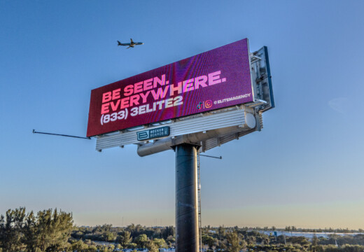
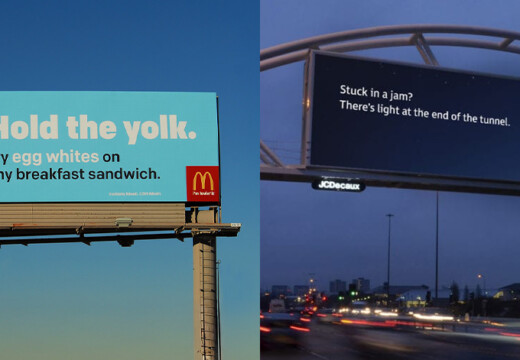
Billboard advertising works because it’s visible, simple, and effective. 71% of drivers notice billboards, and digital ones can convert 65% of impressions into actions. Here’s how to design great billboards:
- Keep it simple: Use bold colors, high contrast, and a short message (7-8 words max).
- Use readable fonts: Sans-serif fonts like Arial or Helvetica work best. Text should be big enough to read from a distance.
- Pick the right colors: High contrast (e.g., black on yellow) boosts recall by 38%.
- Design for all conditions: Adjust for lighting, weather, and time of day.
- Use striking images: Eye-catching visuals grab attention in under 3 seconds.
Billboards are affordable, costing $250–$750 per month, and can increase campaign results when paired with other media. Focus on clear, memorable designs to make your billboard stand out.
Color and Contrast Techniques
Using Strong Color Contrast
Strong color contrast plays a key role in making billboards clear and engaging. Here are some effective combinations to consider:
- Black text on a yellow background: Perfect for urgent messages.
- White text on a blue background: Conveys trust and reliability.
- Dark text on a light background (or vice versa): Ensures readability in most conditions.
"Contrast refers to the difference between 2 shades of color. If your logo text is light in color, use a dark background color." – Penneco Outdoor Advertising
When choosing colors, make sure they not only stand out but also align with your brand’s identity.
Color Choice and Brand Message
Your color palette should reflect your brand while being highly visible. A great example is Spotify’s 2020 campaign, which used magenta, yellow, and cyan to match its playful image and grab attention in urban settings.
Key tips for color selection:
- Stick to three main colors and ensure accessibility for color-blind viewers.
- Factor in the environment where the billboard will be displayed.
- Keep colors consistent with your other marketing materials.
Don’t forget to adjust your design for different lighting conditions to keep it effective at all times.
Design for All Light Conditions
Billboard visibility changes with time of day and weather. To ensure your message stands out, follow these guidelines:
| Lighting Condition | Recommended Approach | Key Consideration |
|---|---|---|
| Bright Daylight | Use high-luminance materials | Apply UV-resistant inks |
| Nighttime | Ensure 300–500 lux minimum | Maintain even lighting |
| Adverse Weather | Opt for bold colors and high contrast | Use durable, weather-resistant materials |
LED displays are especially useful since they automatically adjust brightness based on ambient light and consume less energy than traditional lighting.
To maintain visibility:
- Use matte coatings to reduce glare.
- Schedule regular cleanings and inspections.
- Account for seasonal changes in light conditions.
4 Tips For Eye-Catching Billboard Designs
Text Design for Billboards
Once you’ve fine-tuned colors and contrast, it’s time to focus on the text. Your billboard’s message needs to be understood instantly.
Best Fonts for Billboards
People only have about 5–10 seconds to read a billboard message. This is why sans-serif fonts like Arial, Helvetica, and Futura are often recommended – they’re easier to read from a distance.
Stick to sans-serif fonts with thick strokes, clean lines, and proper spacing. While logos can feature decorative fonts, the main message should always use clear, legible typography.
"A good font for a billboard is easy to read at a glance. Drivers and passersby only have a few seconds to absorb your message, so your font must be clear, bold, and straightforward." – Anna Frieden
Once you’ve picked the right font, adjust its size and layout to make sure it’s readable from the intended viewing distance.
Text Size and Position Guidelines
The size of your text plays a huge role in how well it’s seen. Here’s a quick guide based on viewing distance:
| Letter Height | Best Legibility | Maximum Viewing Distance |
|---|---|---|
| 12 inches | 120 feet | 525 feet |
| 18 inches | 180 feet | 750 feet |
| 24 inches | 240 feet | 1,000 feet |
| 36 inches | 360 feet | 1,500 feet |
For the best results:
- Use 1 inch of letter height for every 10 feet of viewing distance.
- Leave 60% of the billboard as negative space, dedicating only 40% to text and visuals.
- Make the most important information the largest.
- Test your design from the distances people will actually view it.
Keep Text Brief and Clear
With font and size sorted, focus on keeping your message short. Messages under 250 characters on digital signage can boost engagement by up to 60%. Aim for seven to eight words max to grab attention quickly.
Tips for impactful text:
- Highlight the most important information.
- Use active voice to make your message more dynamic.
- Avoid ALL CAPS – it reduces readability by 10%.
- Ensure strong contrast between text and background.
- Test readability from different angles and distances.
sbb-itb-2e2e93f
Image Selection and Use
Picking Eye-Catching Images
Choose visuals that grab attention immediately. For billboards, focus on these essentials:
- Use high-resolution photos or vector art that stay sharp at any size.
- Opt for simple, bold images that communicate your message in under 3 seconds.
- Ensure your visuals are effective in large formats.
Once you’ve chosen your images, adjust their clarity and scale to fit billboard dimensions.
Designing Clean, Clear Images
Billboard visuals require specific technical adjustments to ensure they appear sharp and professional. The standard billboard size is 14 feet high by 48 feet wide (672 square feet).
| Image Specification | Recommended Value |
|---|---|
| Minimum Resolution | 11.2 DPI |
| Standard PPI Range | 10–30 PPI |
| Optimal Resolution | 150 PPI at 100% size |
A standout example is Simply Roasted‘s UK campaign, which showcased oversized crisp packets near Waitrose supermarkets. The minimalist design and 3D effect made the visuals pop.
Key steps to ensure clarity:
- Test your design in a virtual 3D space to check visibility from different angles.
- Factor in viewing distance when deciding on image size and resolution.
- Use professional tools like Adobe Illustrator or Photoshop for precise scaling.
These adjustments ensure your billboard delivers its message effectively.
Incorporating Logos and Product Photos
Once your images are polished, integrate brand elements naturally into the design. Stick to the rule of three visuals – a main image, a headline, and a logo. This keeps the layout clean while reinforcing your brand.
Tips for effective branding:
- Place your logo in the lower half for better integration and visibility.
- Keep branding consistent across all elements.
- Avoid stretching or distorting your logo to fit the space.
Spotify offers a great example by consistently placing their logo in the bottom left corner of their billboards. This approach ensures instant brand recognition while keeping the focus on the primary message.
"A good font for a billboard is easy to read at a glance. Drivers and passersby only have a few seconds to absorb your message, so your font must be clear, bold, and straightforward." – Anna Frieden
Layout and Design Structure
Using the Rule of Thirds
The rule of thirds helps create a visually appealing billboard by dividing the space into nine equal sections. This layout naturally guides the viewer’s eye to important elements. Here’s how to use it:
- Headline: Position it along the top horizontal line.
- Main image: Place it at one of the four intersection points.
- Logo: Align it near the bottom horizontal line.
- Spacing: Leave enough room between elements for clarity.
This approach establishes a clear visual hierarchy, making it easier for viewers to focus on the key message.
Building Visual Priority
Once the layout is balanced, focus on prioritizing the elements to ensure the message grabs attention. Place the main message in the top third, add a supporting element at a key intersection, and position the call to action in the lower area.
"Billboard messages should be straight to the point, focusing on a single key message or call to action. So one of the most important billboard design rules to follow is keeping your message short." – Seen Outdoor
You have just about 3 seconds to capture a driver’s attention. Use high-contrast colors and plenty of white space to make the message stand out.
Sizing for Different Billboards
Adapt your design to fit the dimensions of each billboard type to ensure clarity and maintain a cohesive look.
-
Standard bulletins (14 feet × 48 feet):
- Use 1 inch of text height for every foot of viewing distance.
- Keep the resolution at 300 DPI at actual size.
-
Urban posters (10 feet × 22 feet):
- Adjust the image resolution based on the viewing distance.
- Test readability at actual size.
-
Digital billboards:
- Submit artwork in standard aspect ratios to ensure proper scaling across various displays.
Tailoring your design to each format ensures your message remains impactful and easy to read, no matter the billboard type.
Conclusion: Implementation Steps
Main Points Review
Creating effective billboards boils down to keeping things simple and clear. Focus on straightforward messaging, bold and contrasting colors to grab attention, and text that’s easy to read from a distance. For large billboards, a font height of at least 18 inches is recommended. These basics are key to launching successful billboard campaigns.
Getting Started with Billboards
With the design essentials in mind, it’s time to take the next step. Platforms like Blip make it easier for small businesses to dive into billboard advertising without breaking the bank.
"It’s not a social media thing that you see on your phone. It’s not word-of-mouth. It’s big and bold and out there in public. I would say this is the first step of looking big and public." – Chris Leslie, Founder, Leslie Lightcraft Co
Billboards offer a strong return on investment, with some studies reporting a 497% ROI. Here’s how to make the most of your billboard campaigns:
- Track Performance: Use tools like promo codes or unique landing page URLs to measure the impact of your ads.
- Keep Content Fresh: Regularly update your billboard to maintain audience interest.
- Maximize Visibility: Position your billboard to face oncoming traffic and ensure it’s visible around the clock.
Research shows that 82% of people remember digital out-of-home ads. Platforms like Blip make billboard advertising accessible, allowing small businesses to tap into this powerful marketing tool without hefty upfront costs.
"Blip reinvents an old way of marketing and makes it so that anyone can run a billboard campaign from their own computer. [Using Blip] was a huge value." – Dave Nantz, CEO, Jack’s Donuts


